Forms
Adding in (Web)App
Would you like to communicate more efficiently with guests via the (Web)App? By adding a form, guests can easily submit reservations (for bicycles, restaurants, or the spa), place sandwich orders, or send other requests. All submitted information is automatically forwarded to the (reception) email address.
Collecting information
Want to communicate with guests via the (web)app? You can embed a form in the (web)app. Forms can be used for reservations (e.g., for bicycles, restaurants, or the spa), but also for sandwich orders or requests. This data is then sent to the (reception) email.
Form settings
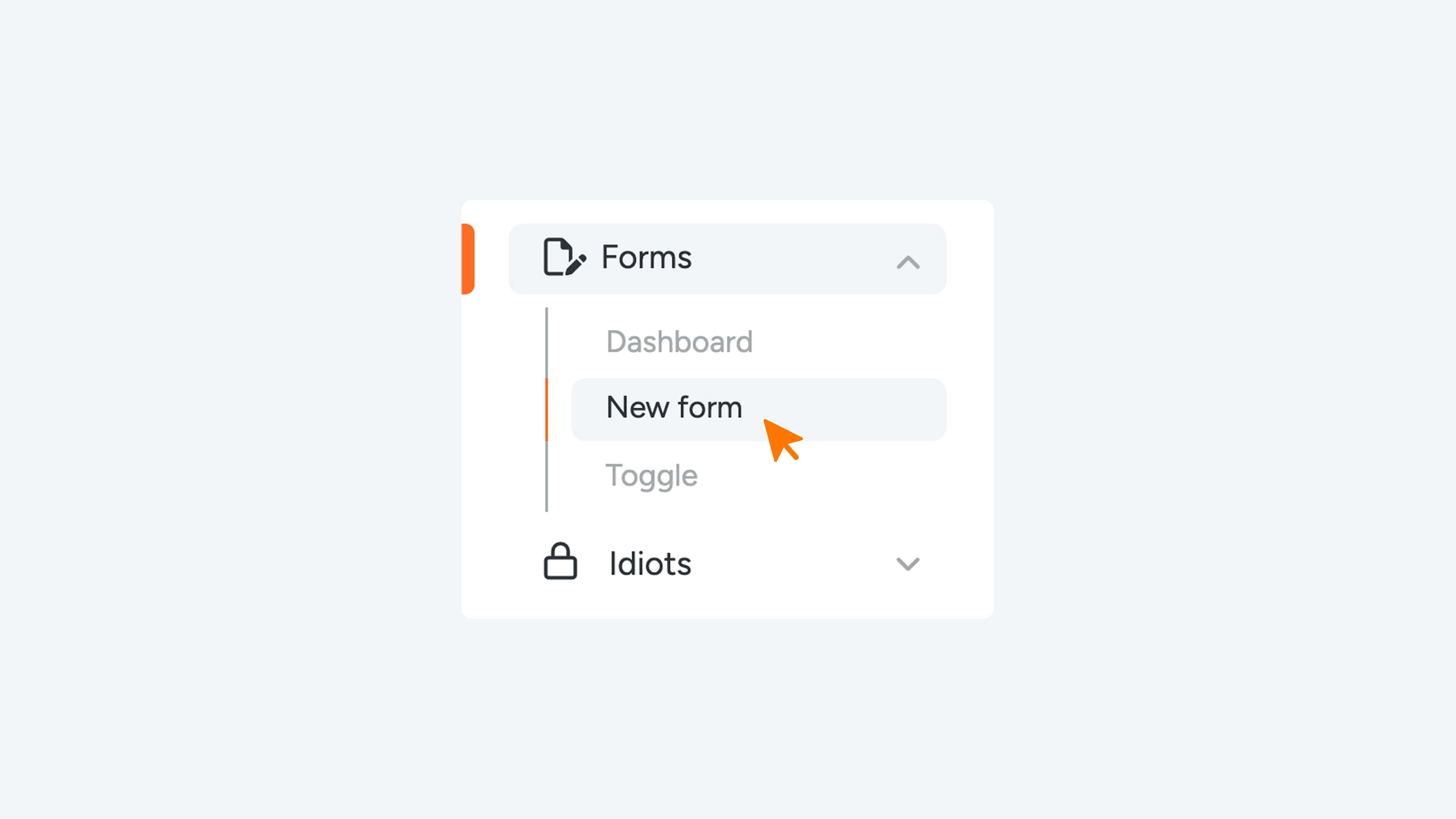
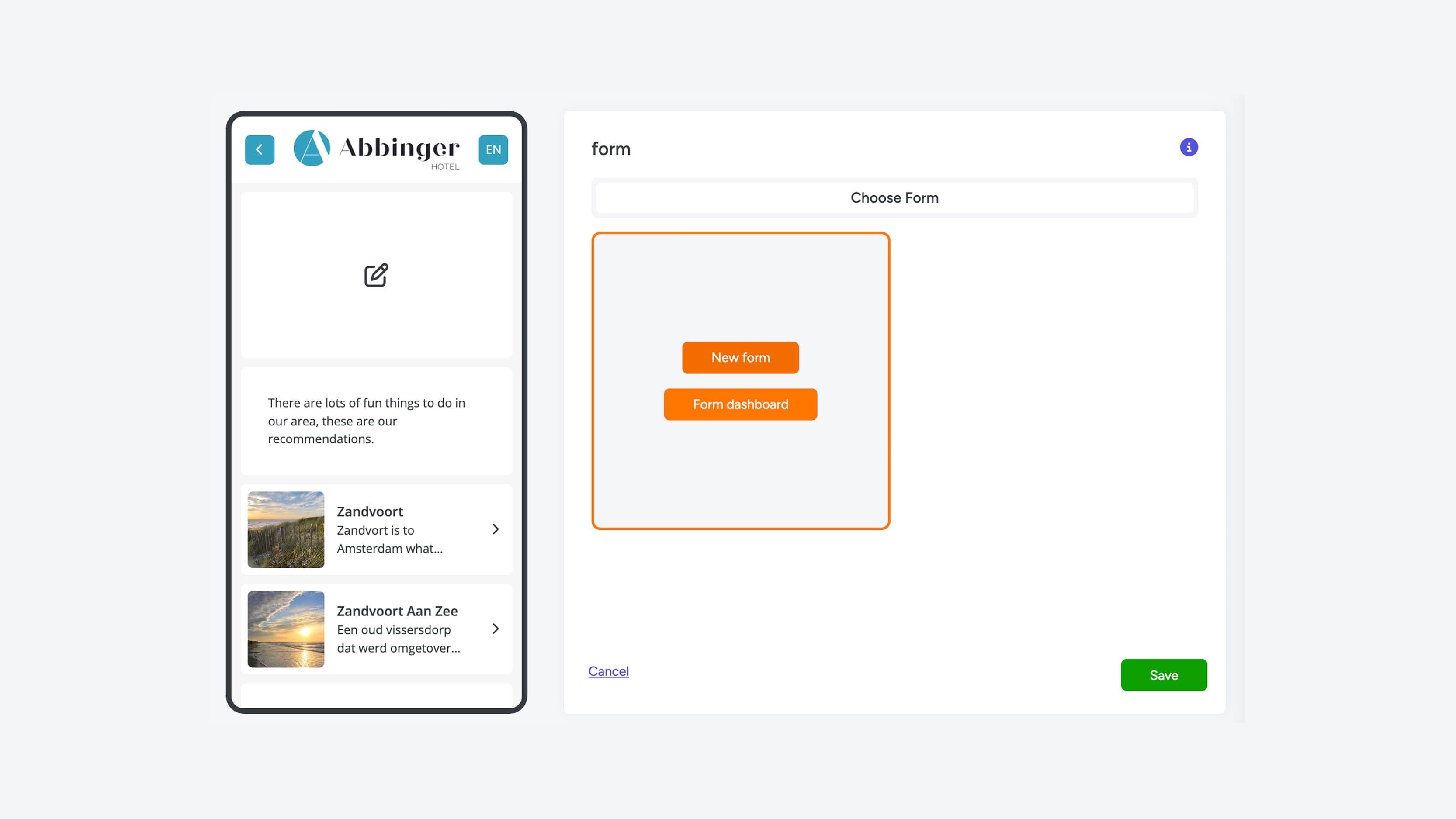
When you click on ‘Forms’ in the menu, you will see the option to create a new form under the New Form section.
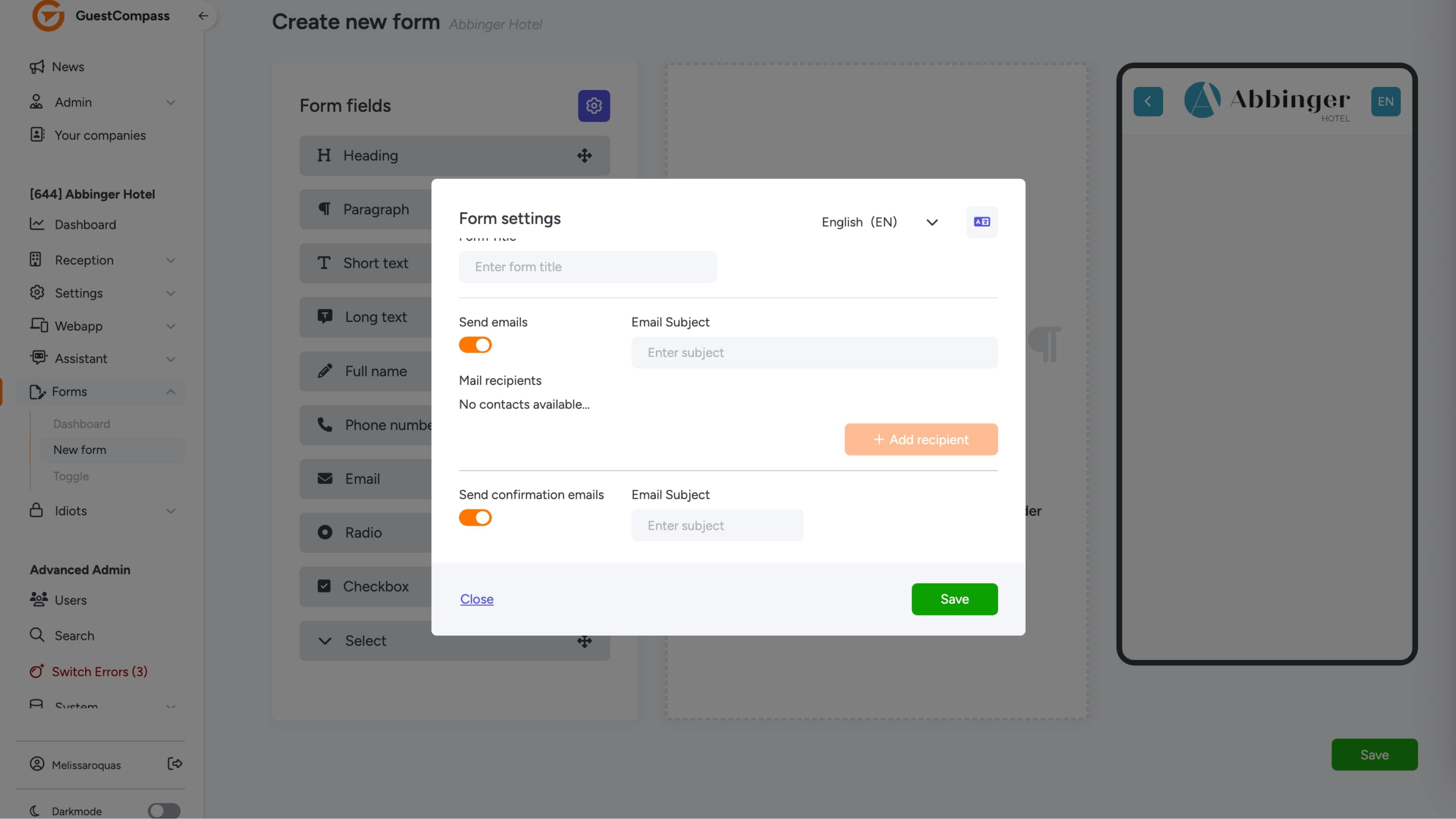
In Form Settings, you enter the required information that is essential for the form to function properly:
Form Title
This is the title of your form. It is recommended to choose a clear and recognizable title so you can easily identify which form has arrived in your email inbox. This makes managing your forms simpler and more organized.
Send Emails
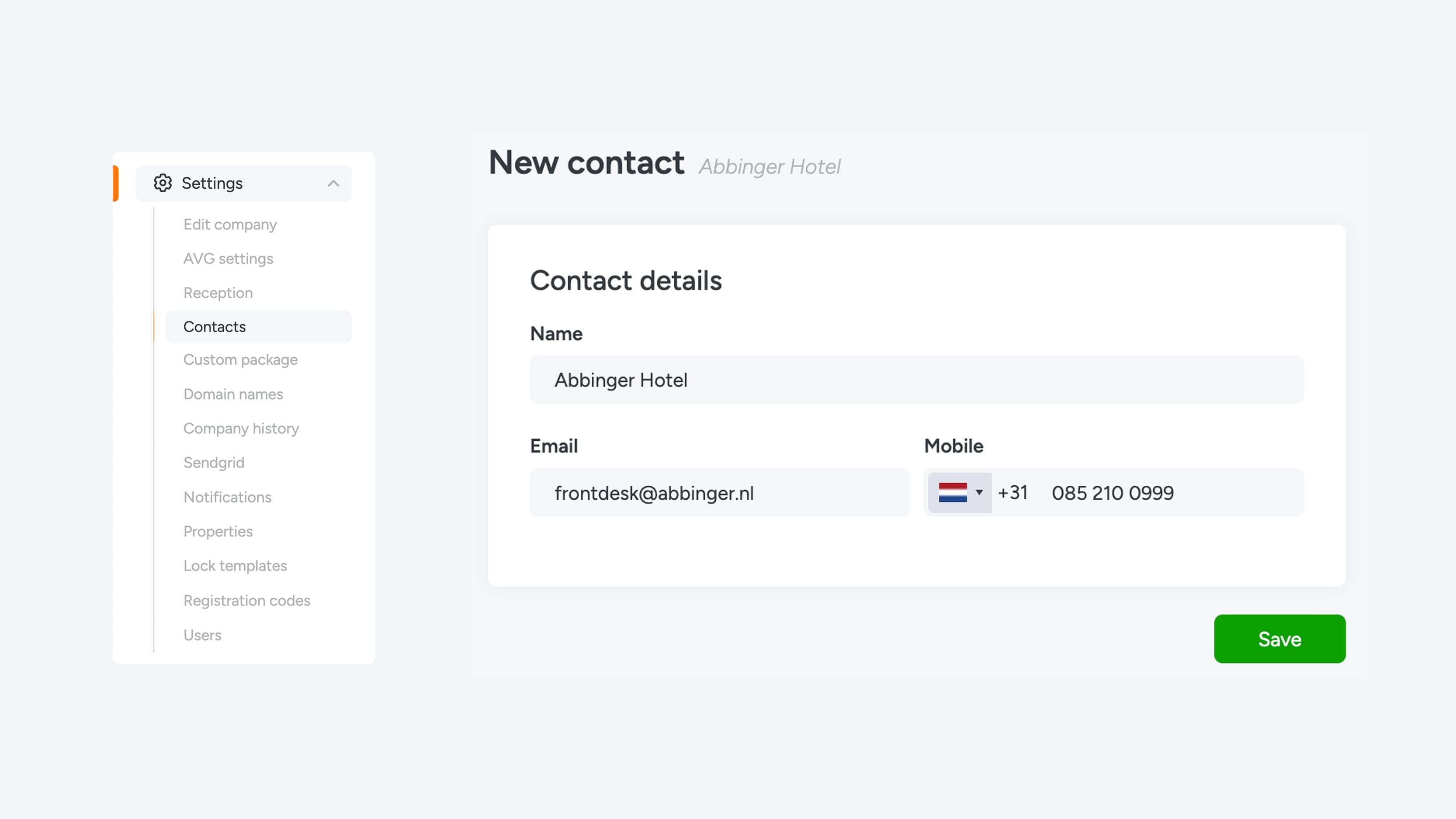
Here you can set the subject of the email that is sent when the form is submitted. You can also specify who will receive the email. To configure this correctly, first go to Settings > Contacts and enter the contact details of the reception or the relevant staff email addresses. Once this is done, you can select who will receive a notification when a form is completed.
Send Confirmation Emails
Would you like to send a confirmation to the user who submitted the form? With this option, you can easily enable an automatic confirmation email that is sent as soon as the form is successfully submitted.
After entering all required information, you can use the button in the top-right corner to check the form translations or adjust the fields per language. Don’t forget to save the Form Settings by clicking the green Save button so that all changes are stored.
Once you've entered all the necessary information, you can use the button in the upper right corner to check the form's translations or edit the fields for each language. Don't forget to save the Form Settings by clicking the green "Save" button to save all your changes.
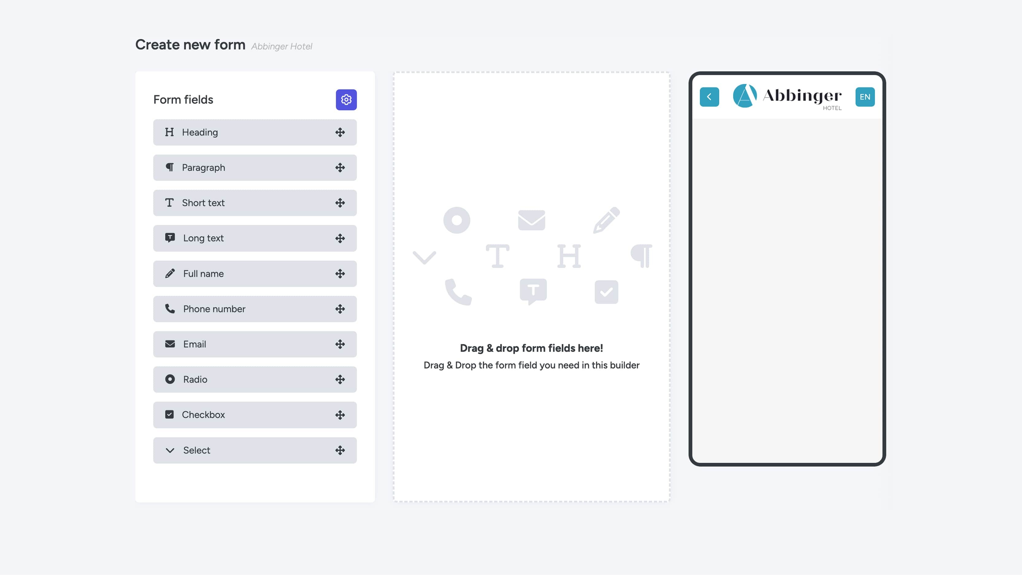
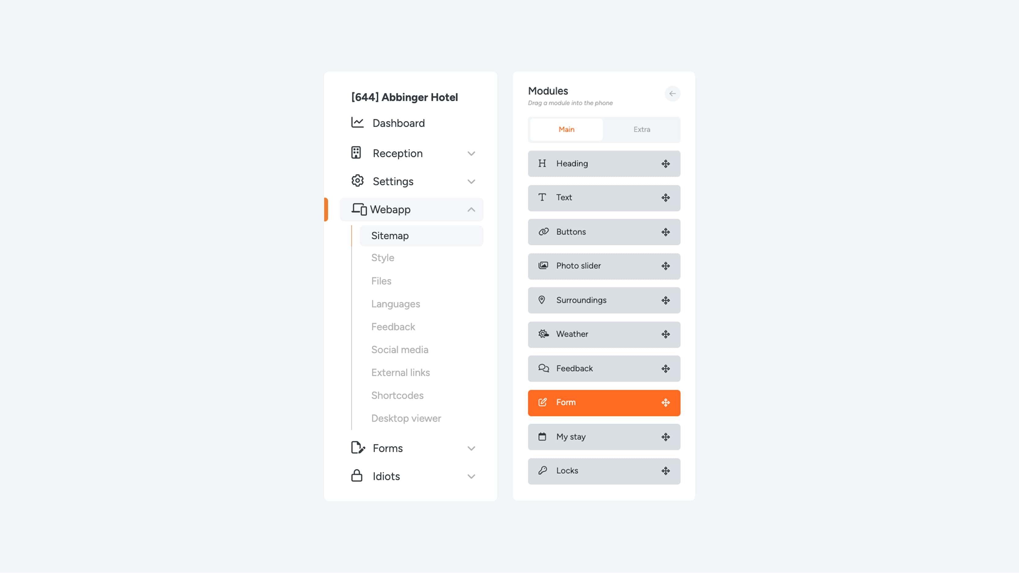
Buidling a Form
Once you have completed the Form Settings, you can start building the actual form. The screen is clearly divided into three sections: Form Fields, the Drag & Drop area, and the Phone Preview.
To get started, simply drag a form field from the available options into the Drag & Drop area.
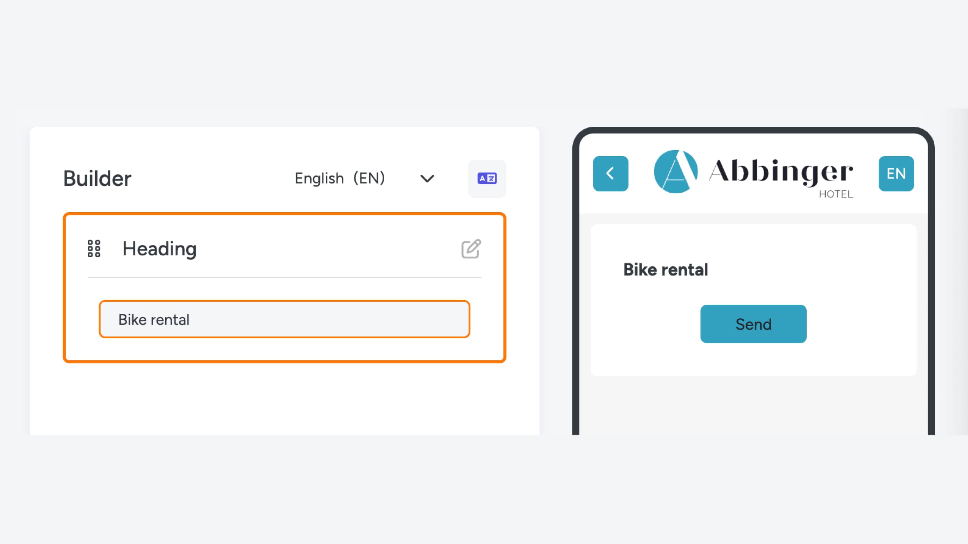
- Heading
A heading is used to introduce or clarify a section or topic within the form.
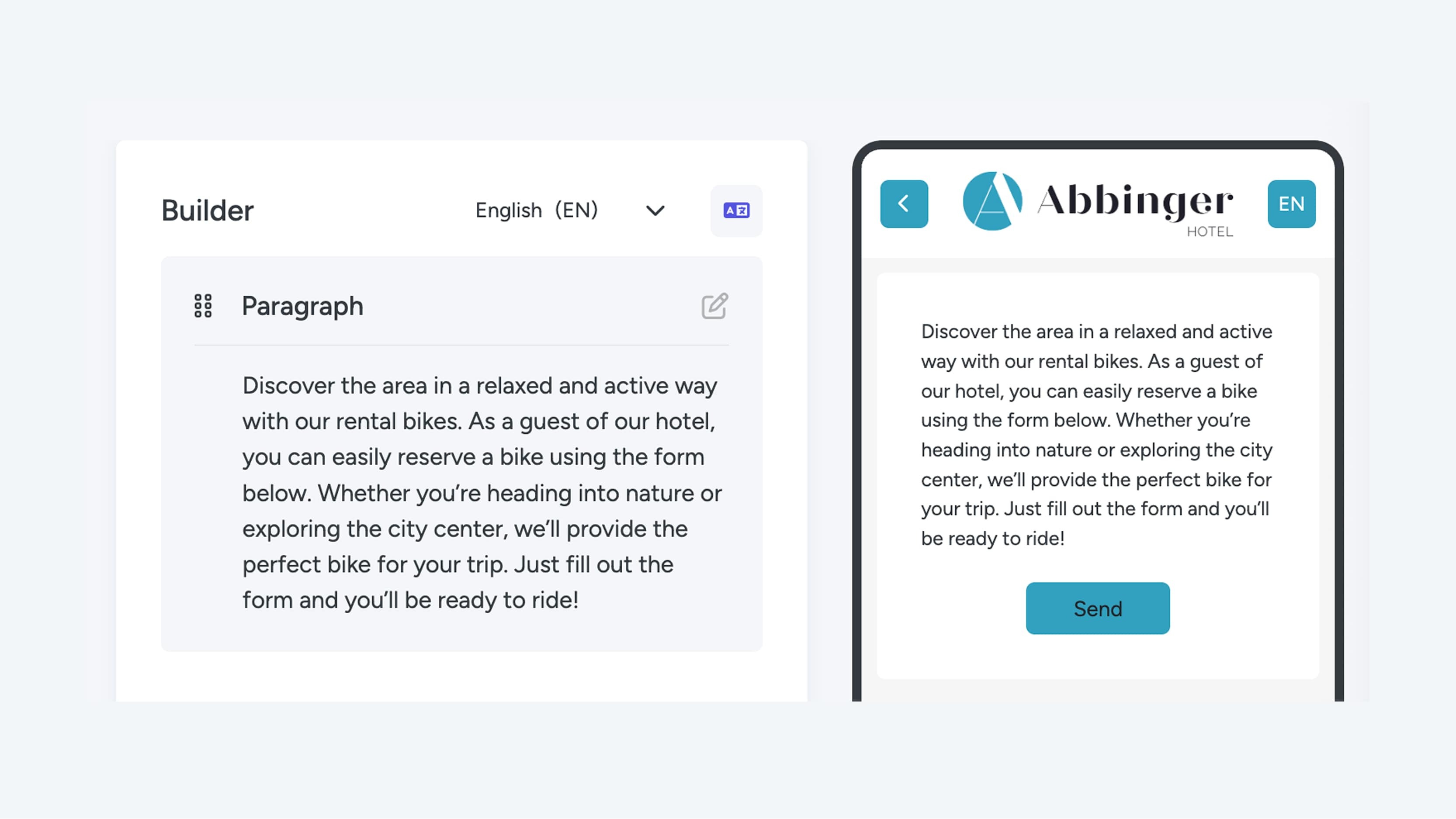
- Paragraph
This field allows you to add a short text, for example to introduce the form or explain the fields that follow. If you want to add longer text, such as detailed explanations or instructions, it is recommended to add a Text Module directly to the page instead.
Short Text
This field is ideal for collecting short, concise answers such as names or other brief information.- Long Text
This field is suitable for collecting longer responses, for example for a “questions & comments” field where users can provide more detailed input.
Full Name
This field asks the user to enter their full name.- Phone Number
This field is specifically designed for entering phone numbers and ensures the input is collected in the correct format.
- Email
This field is used to collect an email address and automatically checks whether the entered address has the correct format (e.g. name@domain.com).
- Radio
A radio field contains multiple options, but the user can select only one. This is ideal for multiple-choice questions where only one answer is allowed.
- Checkbox
This field consists of multiple options from which the user can select more than one answer. It is perfect for questions where multiple selections are allowed.
- Select
A Select field is displayed as a dropdown menu. When clicking on the field, a list of options appears from which the user can make one selection.
For each form field, you can indicate whether it is required by enabling the Required option. When this option is enabled, the user must complete the field before the form can be submitted. This ensures that all necessary information is collected.
As a final step, add text to the submit button.
When all required information has been entered, you can again use the button in the top-right corner to check translations or adjust the fields per language. Don’t forget to save the form by clicking the green Save button so that all changes are preserved.